
.jpg?scalemode=manual&cropmode=pixel&adjustcrop=extend&cropx=1&cropy=38&cropw=317&croph=116&format=WEBP)


.jpg?format=WEBP)
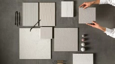


The most popular colour palettes
Which is your favourite colour?
Answering this question may seem easy, but it actually hides some interpretations not to underestimate. Especially when it’s about fashion or design: because if it’s true that trends come and go, it’s also true that they keep on lasting as an efficient way to identify a certain historical period. Some years ago, for example, the millennial pink had conquered first the social feeds and then people’s wardrobes: it became popular because it represented a generation and a movement, both uprising.
Today it’s no longer time for pink, or at least not in the design world. If asked “which is your favourite colour” current trends answer with green, blue, yellow and red. They represent positivity, interior strength and willingness of doing. Arkshade chose them too: here’s the ultimate chromatic collection suggesting fashionable colours to dress our homes.
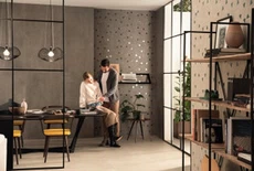
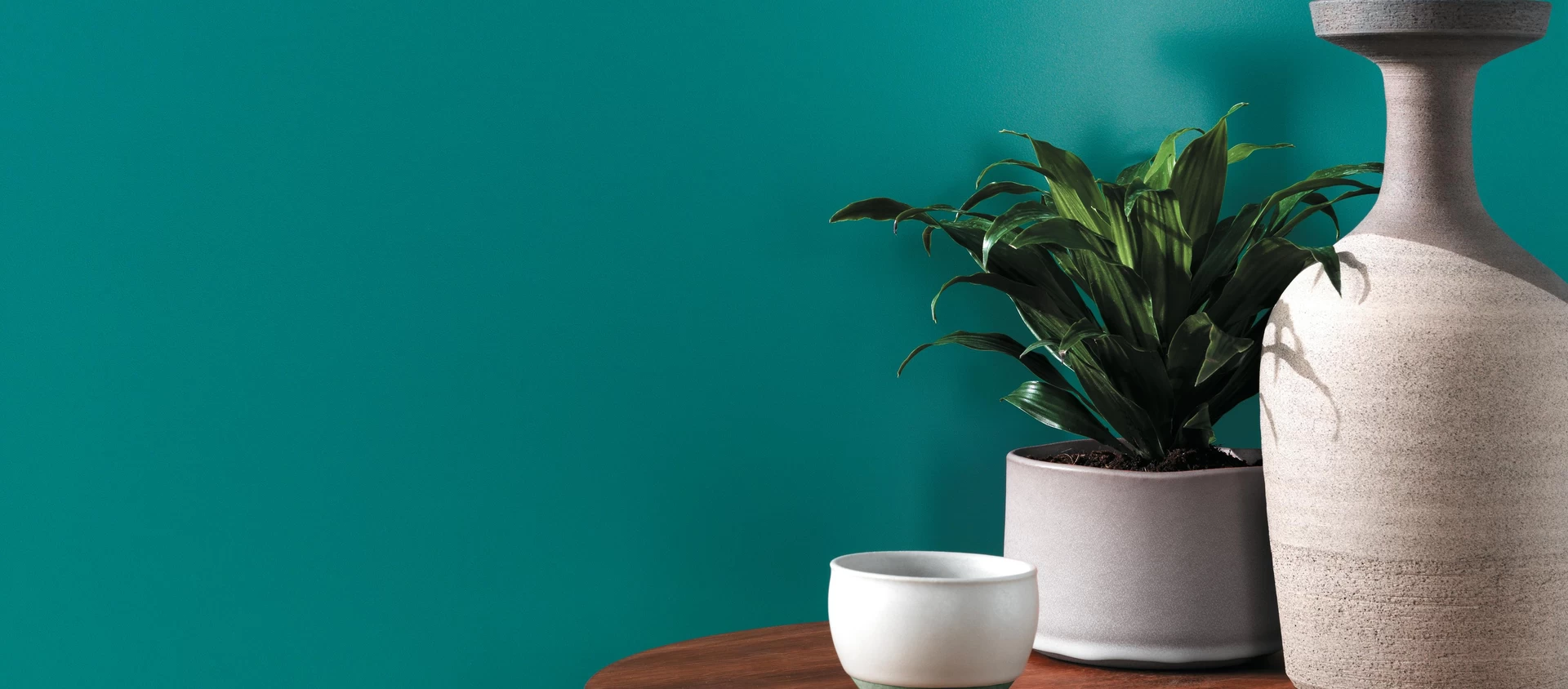
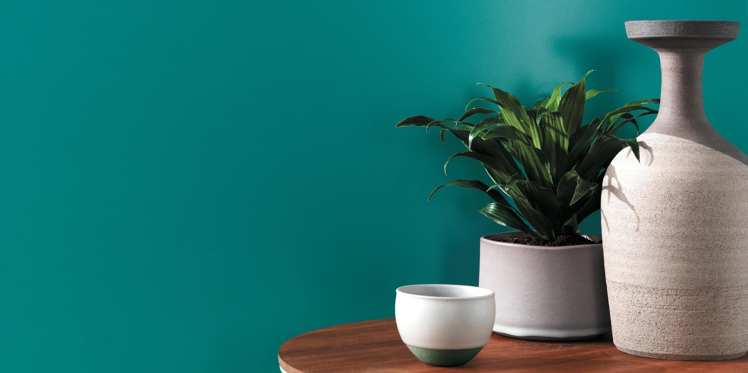
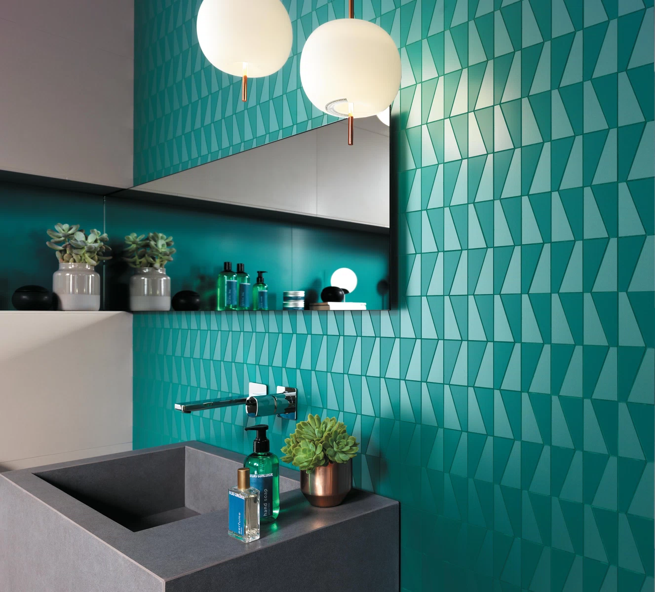
1. GREEN
Atlas Concorde inspiration – Arkshade Wall in the Gemstone variation together with its colour palette
In 2017, the Pantone Institute chose greenery as the colour of the year: standing for new impulses and for a regeneration “au naturel”, it went against the Blue Avatar (Facebook) and the constantly-overshadowing technology. Current trends haven’t completely turned off the greenery brightness, achieved by adding a touch of yellow, but they do have changed it: this year green is still à la page but with a more sophisticated hue, although it very much resembles the one we find in nature. It’s the gemstone green we’re talking about: a darker shade you can also find in the Arkshade collection.
The meaning – In chromotherapy, green has the power to soothe and relax, as well as enhance the introspective skills and instill trust. Choosing to dedicate an entire room to green, like the bathroom for instance, it is hopefully a harbinger to keep the stress levels low and to adopt a more relaxed way of living in line with natural balances.
Altas Concorde suggests – Arkshade Mosaico Sail, graphic mosaic effect with optical inspiration.
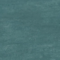
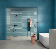
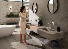
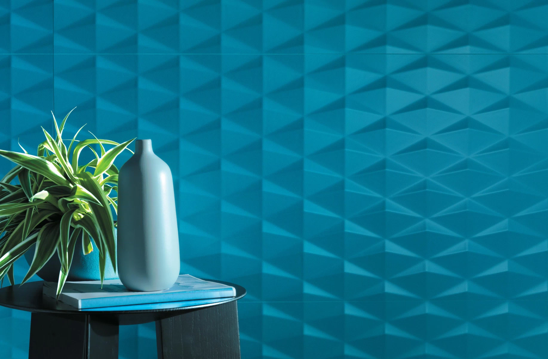
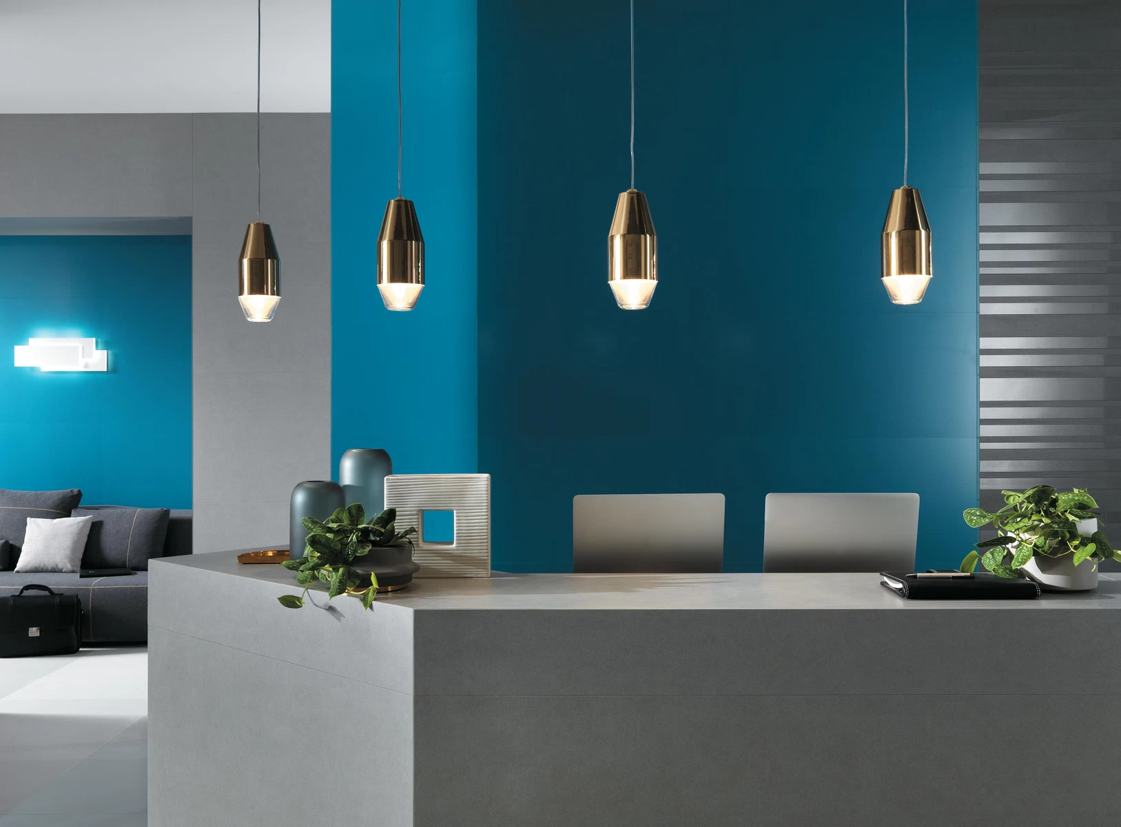
2. BLUE
Atlas Concorde inspiration – Arkshade Wall in the Blue variation together with its colour palette
It was Picasso’s and Monet’s favourite, as well as Yves St Laurent’s and Yves Klein’s. Everybody likes it because it’s versatile and expressive, and because it defines a style that is both relaxing and elegant: this is why blue has (almost) always been trendy. We must point out “almost” because in the last few years black had taken over basically everything, especially fashion-wise, leaving blue no longer playing an exclusive role. But things have finally changed: since last Autumn, in fact, we’ve witnessed a new blue-wave. Far-off from the light shades resembling to white and from the darkest hues similar to black, the trendiest blue is well-characterized by one thing – depth. That goes along with its powerful and effective strength, capable of infusing balance.
The meaning – The colour of sea, of sky and of space: of somewhere else, to put it in other words, that seems to be far away from earthly troubles. It’s not by chance that in ancient Egypt, blue was associated to Gods. Today, blue symbolizes concepts like peace and ease of mind, and it’s considered capable of generating a relaxing atmosphere that balances the emotional sphere.
Altas Concorde suggests – The dark-light contrasts game played by Arkshade 3D Stars Blue.
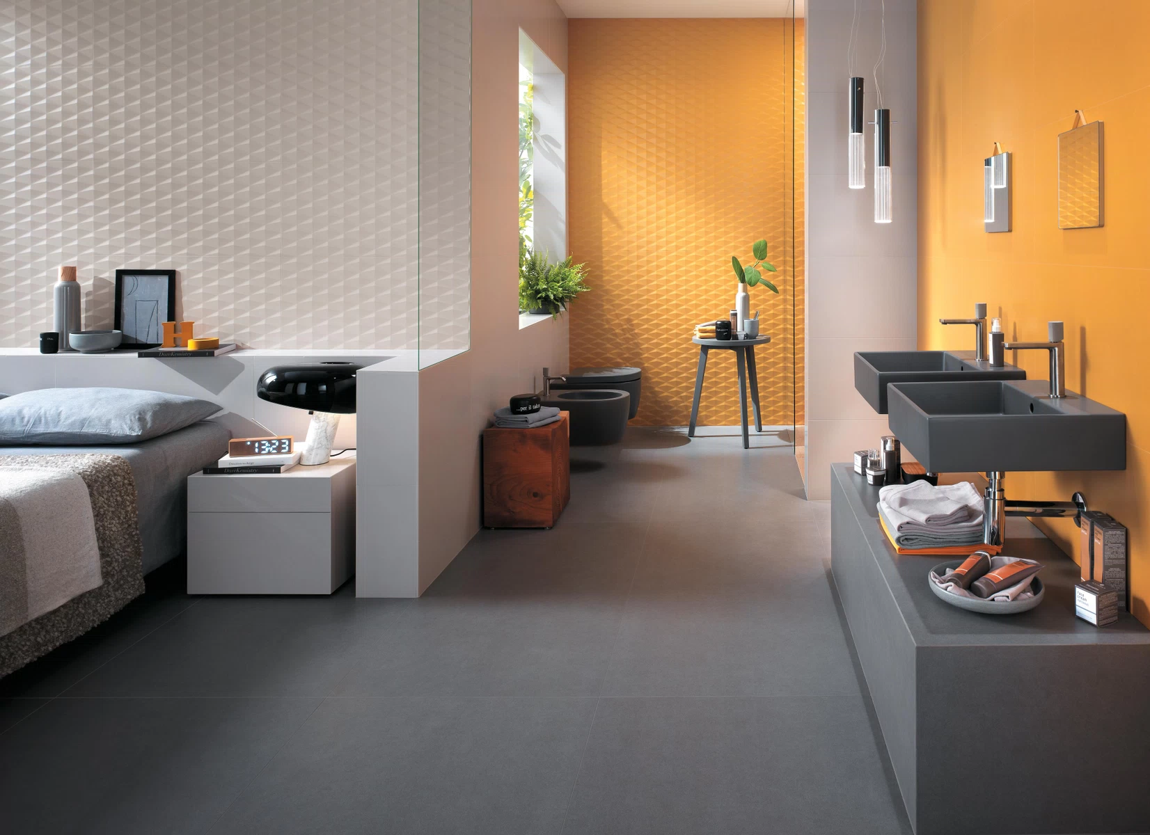
3. YELLOW
Atlas Concorde inspiration – Arkshade Wall in the Yellow variation together with its colour palette
In 2017, we’ve seen it in the most applauded movies and music videos, as well as on catwalks and red carpets. From 2018 on we’ll see it also and foremost in our homes: yellow, the colour mainly linked to summery periods, endures the winter cold thanks to its vitaminic cheerfulness and positive energy. And it does that in a brand-new hue, both shining and delicate, able to lighten up without ever getting boring.
The meaning – Yellow is a lively and meaningful colour standing for the search for new and the power of change. It is a source of light heartedness and politeness, with an eye always pointed at paying attention and learning.
Altas Concorde suggests – The elegant yellow hue of Arkshade Yellow Matte in the matte finishing
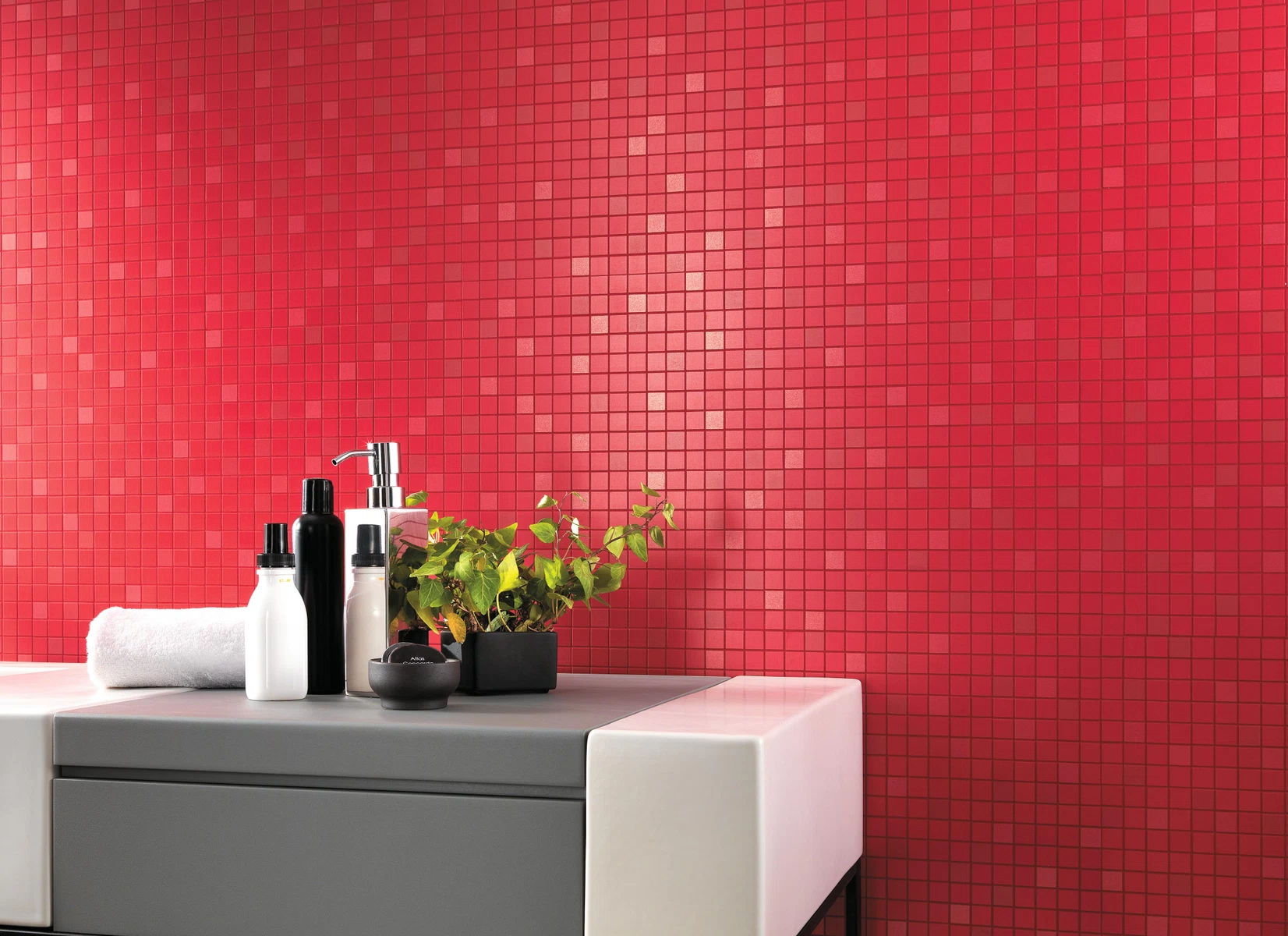
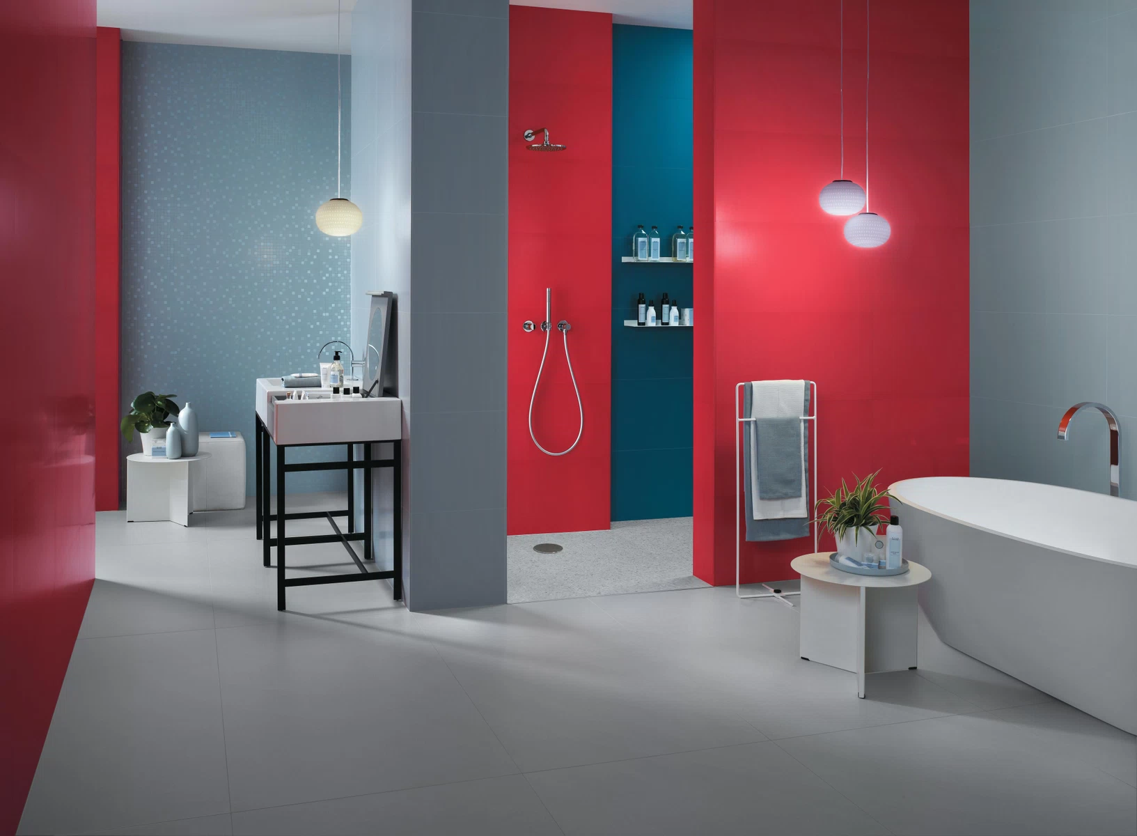
4. RED
Atlas Concorde inspiration – Arkshade Wall in the Red variation together with its colour palette
There are some monochromatic lands in our world. This doesn’t mean they are not spectacular: think about the Mustang Kingdom at the slopes of Himalaya and about its rocks, riverbeds and villages – they are all magnificent and they are all grey-coloured. In this endless monochromatism, the red tunics of Buddhist monks stand out. Red has this power, and not only when it’s surrounded by grey: to stick out and enhance. For this reason, the design world has elected it as one of the trendy colour of 2018: to inebriate your houses with vital strength.
The meaning – Extroversion and willingness: these are the main characteristics of the colour red. Symbolizing a strong and passionate personality, it knows how to instil trust in ourselves and in our future, by galvanizing creativity and intellect.
Altas Concorde suggests –Arkshade Mosaico Q, traditional mosaic effect with regular tiles.
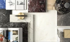
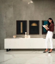
How to couple the 2018 colour palette
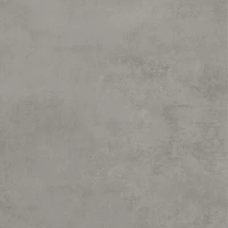
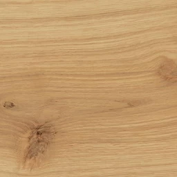
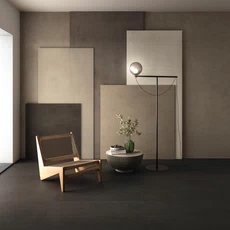
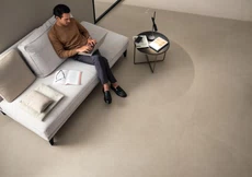
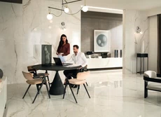
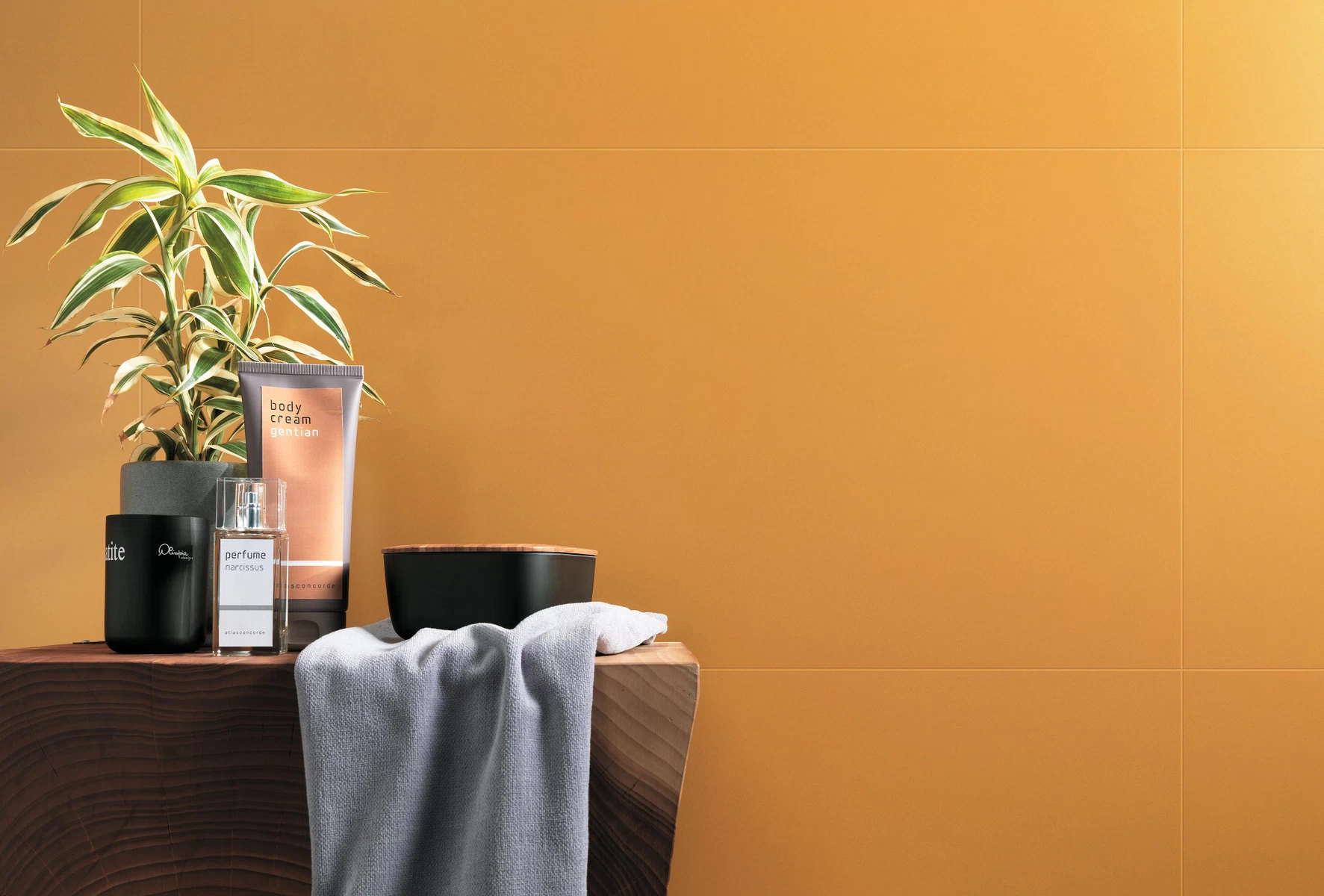
Adding a hint of colour to your house, and doing it by following the up-to-date trends, means adding a vibrant and expressive elegance to your surroundings and to your way of living. Doing it without any aesthetic slips is fundamental. For this reason, in the previous paragraphs we have suggested to you some colour matchings to try and experiment. Our suggestion is to couple vivid colours with neutral matter-inspired coatings. A red wall, for instance, if matched with a stone-look floor is a perfect synthesis of a contemporary urban style. The same goes for the wood-look porcelain tiles, standing for a delicate and essential design, that keeps its intensity and authenticity up.
thanks to
DECOR
Be Inspired