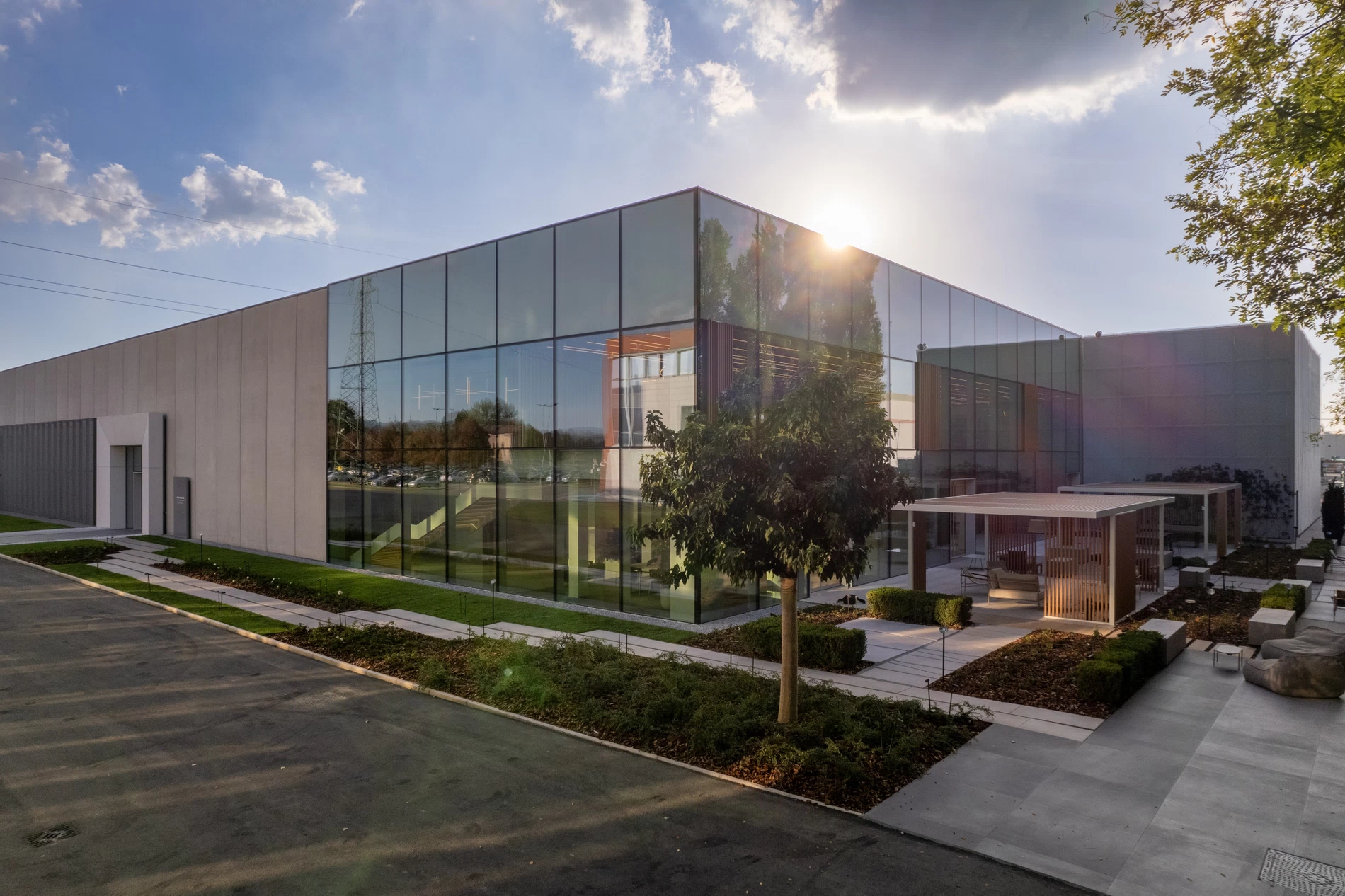


.jpg?scalemode=manual&cropmode=pixel&adjustcrop=extend&cropx=1&cropy=38&cropw=317&croph=116&format=WEBP)


.jpg?format=WEBP)


NestHouse, spaces defined by senses and colors

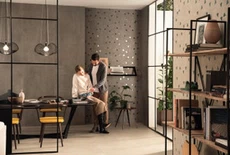
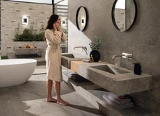
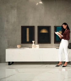
NestHouse designs of spaces and products therefore focus on the endless creative possibilities related to conveying an atmosphere of well-being, starting with touch, smell, and sight. It’s all about experiencing a personal or shared wellbeing of long or short duration related to the senses that produces enduring emotions that become an integral part of our habitat. Sensory materials in the field of design and production thus offer new and original expressions of living for the most personalized wellness possible, with unique emotions and sensations. This can be done even by emphasizing only one specific sense with respect to space and people, both at home and in public spaces. A first sensory component with creative and design significance is color, which can positively connect one's spirit with the context, right down to the smallest element. Brands and consumers are increasingly and consciously proposing and choosing color palettes for domesticity based on their moods, to help them feel unique.
Case History
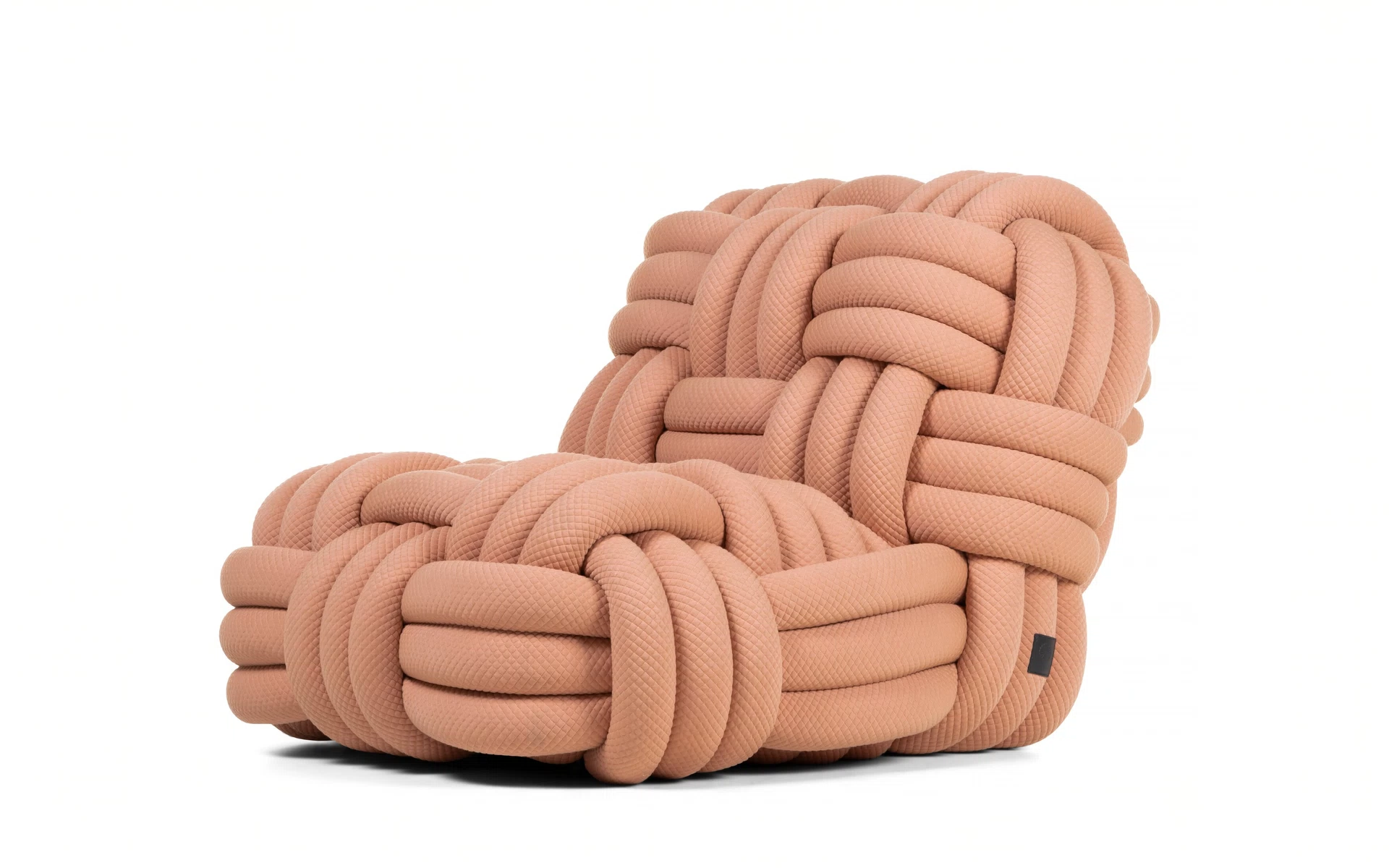
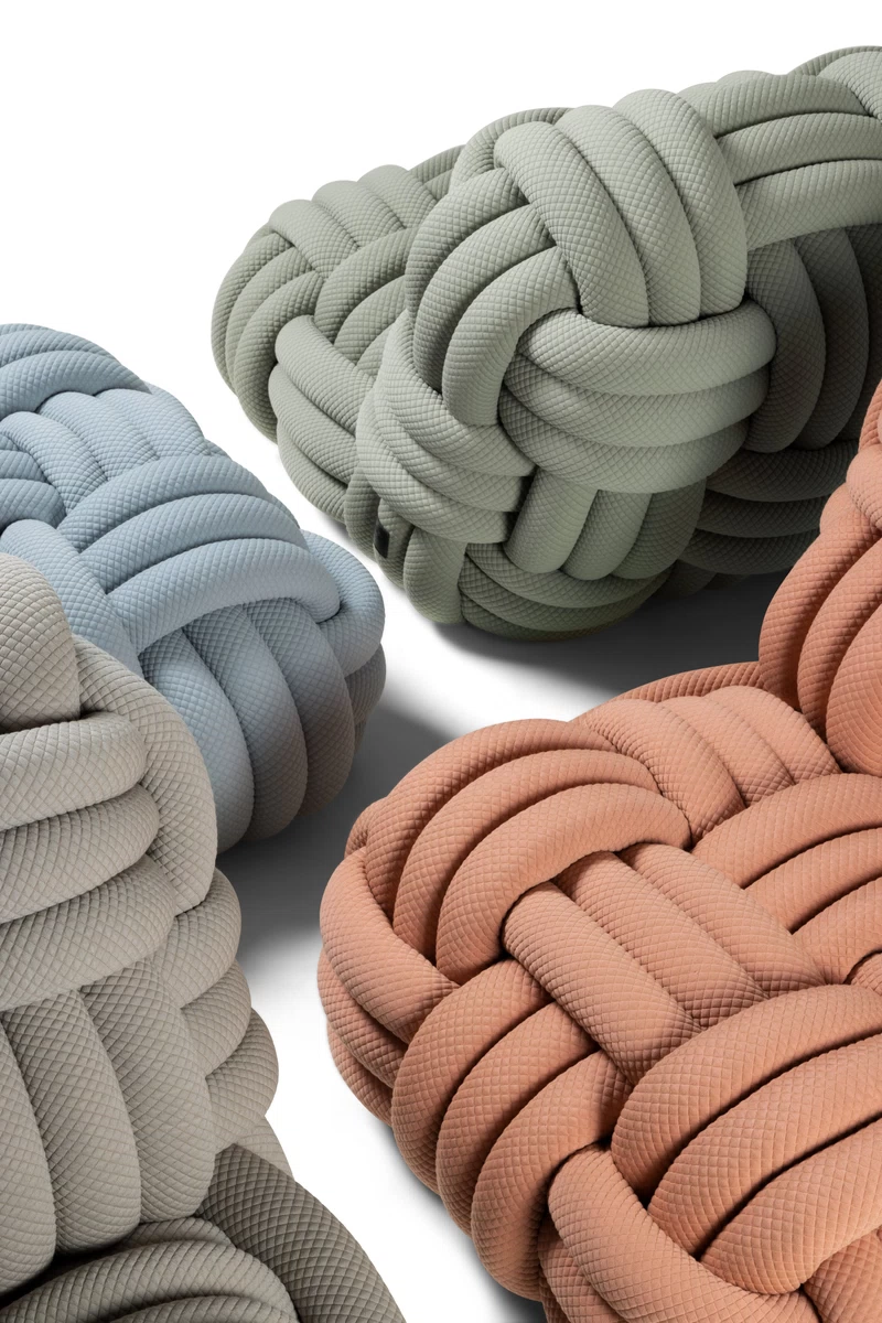
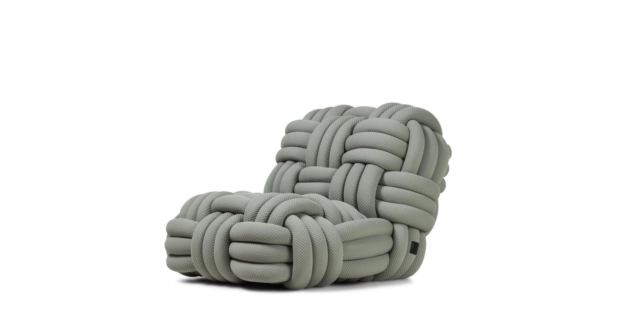
MOOOI Knitty Lounge Chairs, by Nika Zupanc
Presented as part of A Life Extraordinary, the fascinating installation by Dutch brand Moooi for Fuori Salone 2023, this collection of lounge chairs by Slovenian designer Nika Zupanc with an exaggerated materiality stimulates the perception of an enveloping sensoriality. Indeed, it evokes a totally relaxed vibe, as if you were actually softly wrapped in a cozy nest. Extra-thick yarn weaves reminiscent of giant ship ropes are emphasized by the knitted fabric used in the design of the Knitty Lounge Chairs. A very pleasant tactile sensation of softness is matched by the soft emotion conveyed by the colors of fifteen pastel-hued palettes. The designer says she was "inspired on the one hand by small knitting projects, and on the other by the large ropes seen in ports, designing this furniture with the aim of offering a new and disorienting perspective on the use of an everyday product."
.jpg?format=WEBP)
Camile Walala Studio, London
French designer Camille Walala, in collaboration with the Our Department woodworking workshop, renovated the London studio she shares with Julia Jomaa starting from her own creative DNA in which color is an essential design element. Colorful and with an evident playfulness conveyed by the application of the bold color palettes typical of Walala, the Studio recalls her previous works, including the House of Dots for Lego in London. In fact, the designer says that "the desire to feel inspired by the workspace and inhabit the aesthetic fully" won out. Color therefore takes on a disruptive value when used boldly and consistently in order to manifest a true existential vision: "We were like, ‘how colorful should we go? Should we keep it quite simple or should we actually go for it?’"
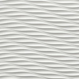
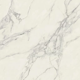
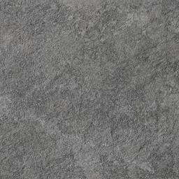
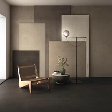
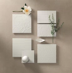
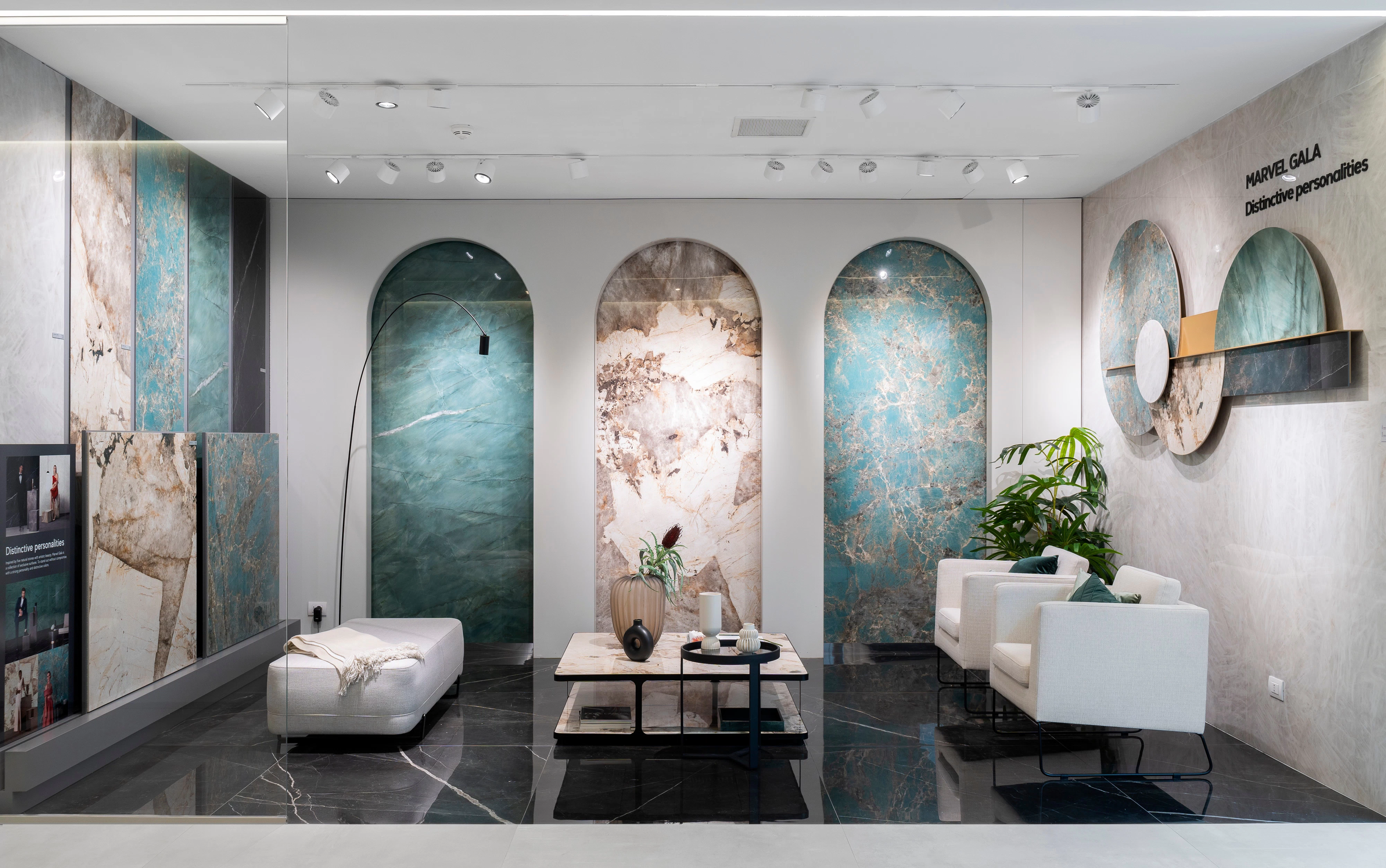
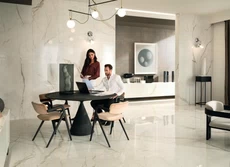
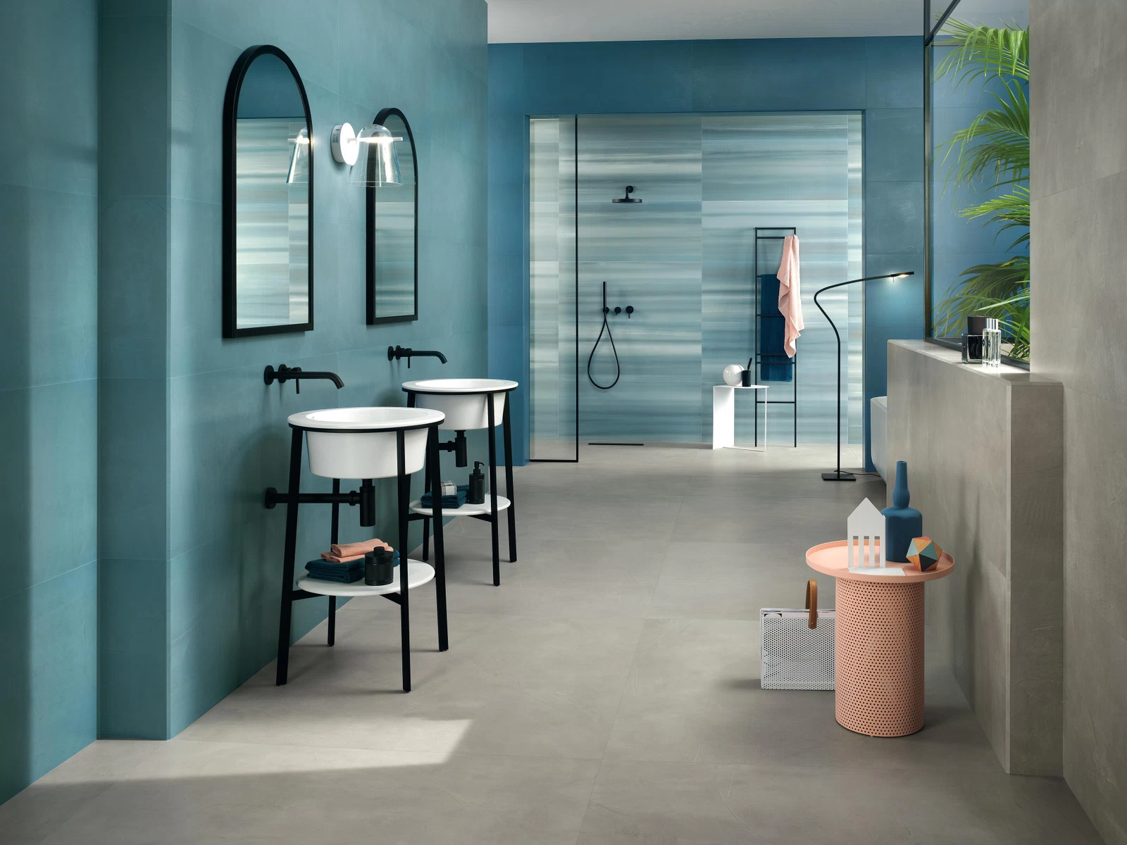
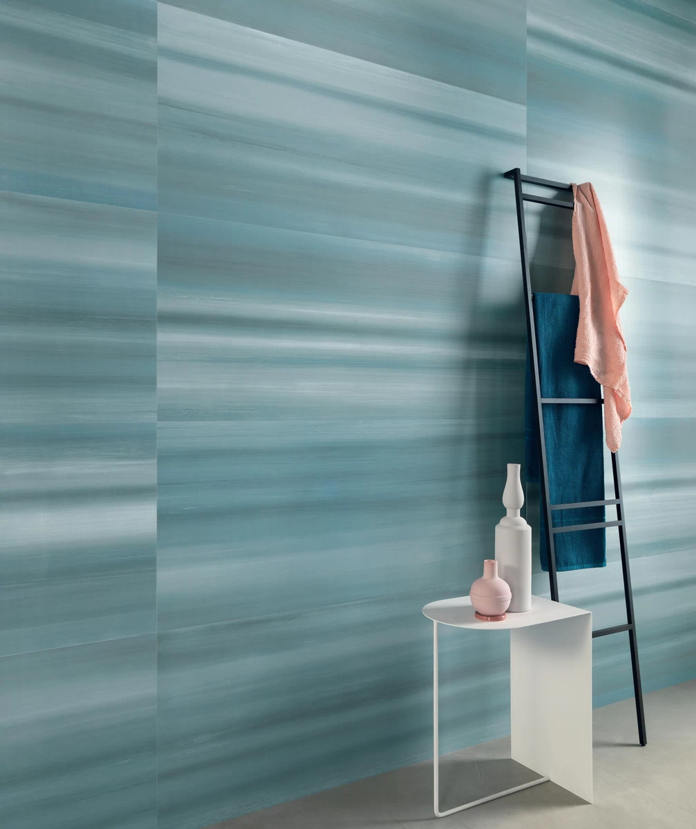
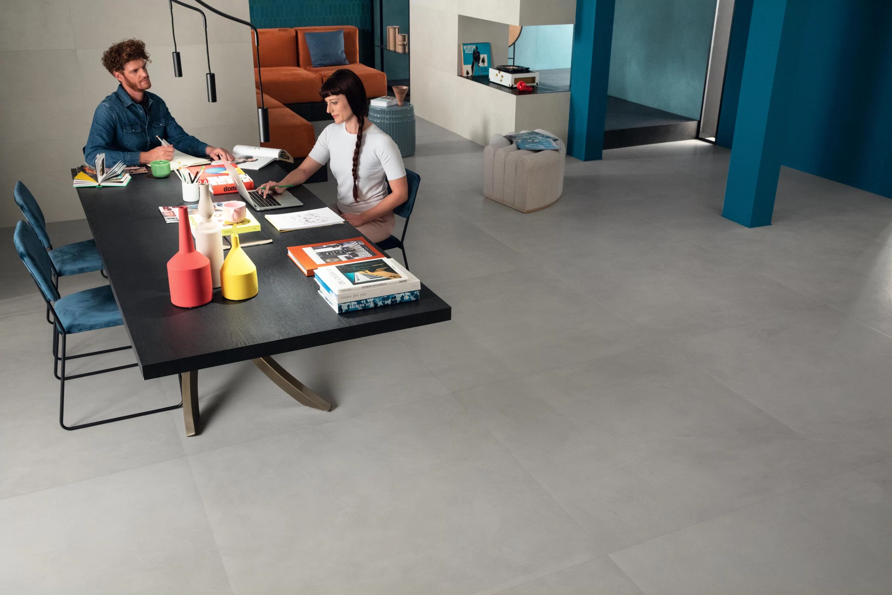
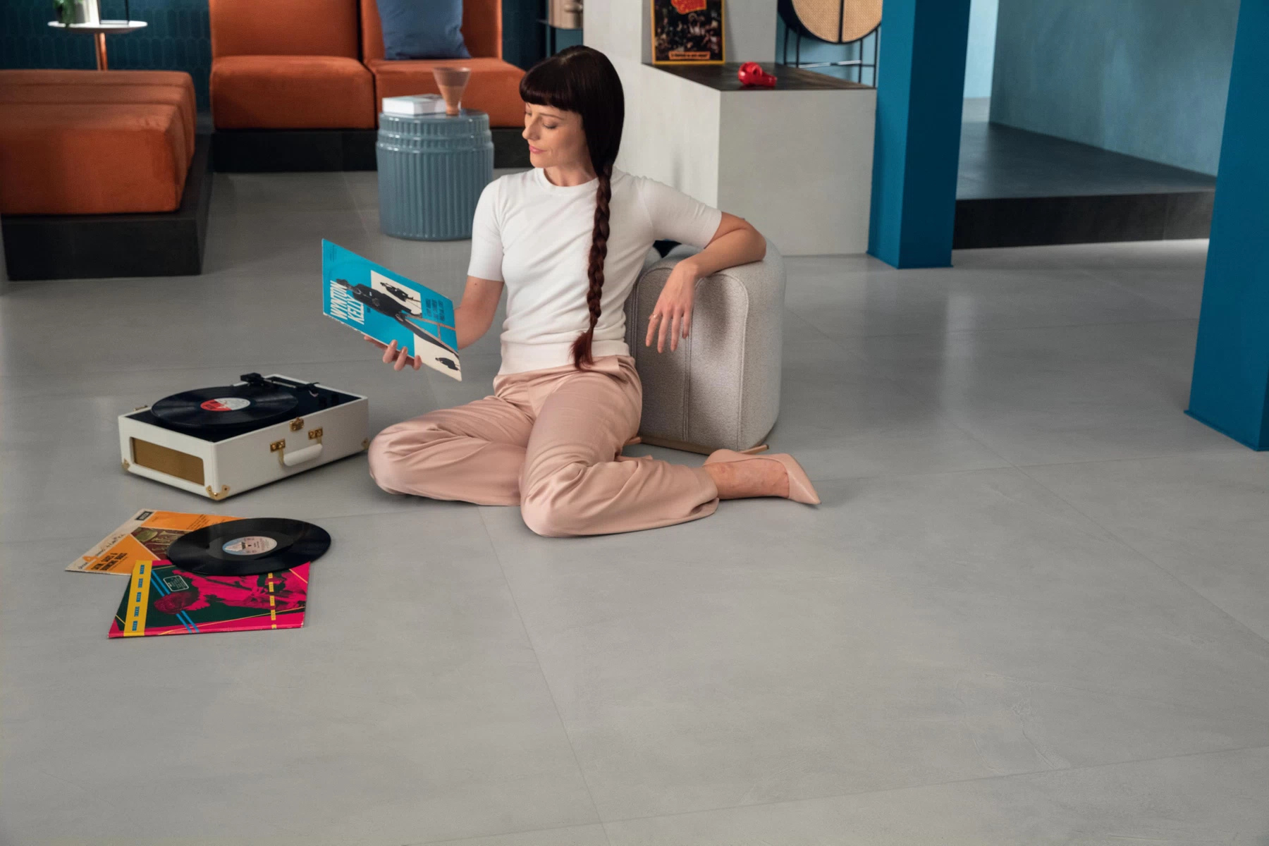
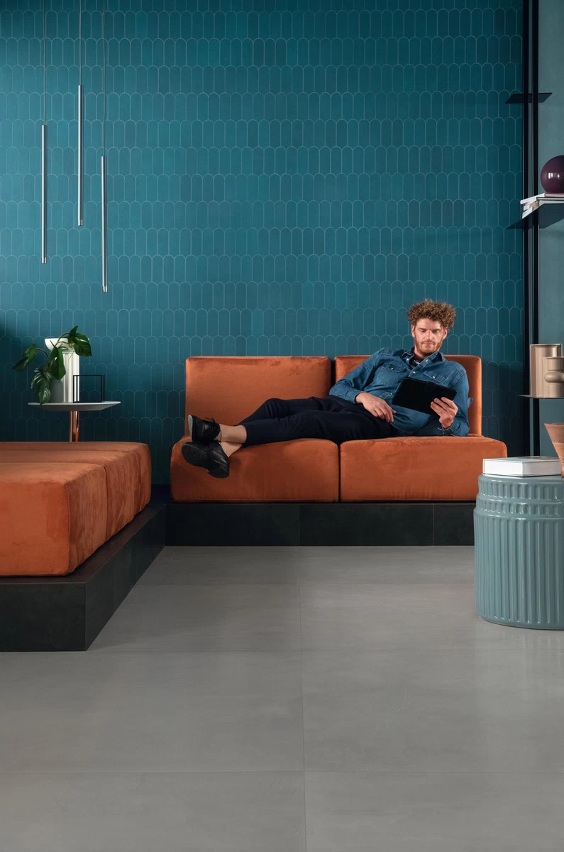
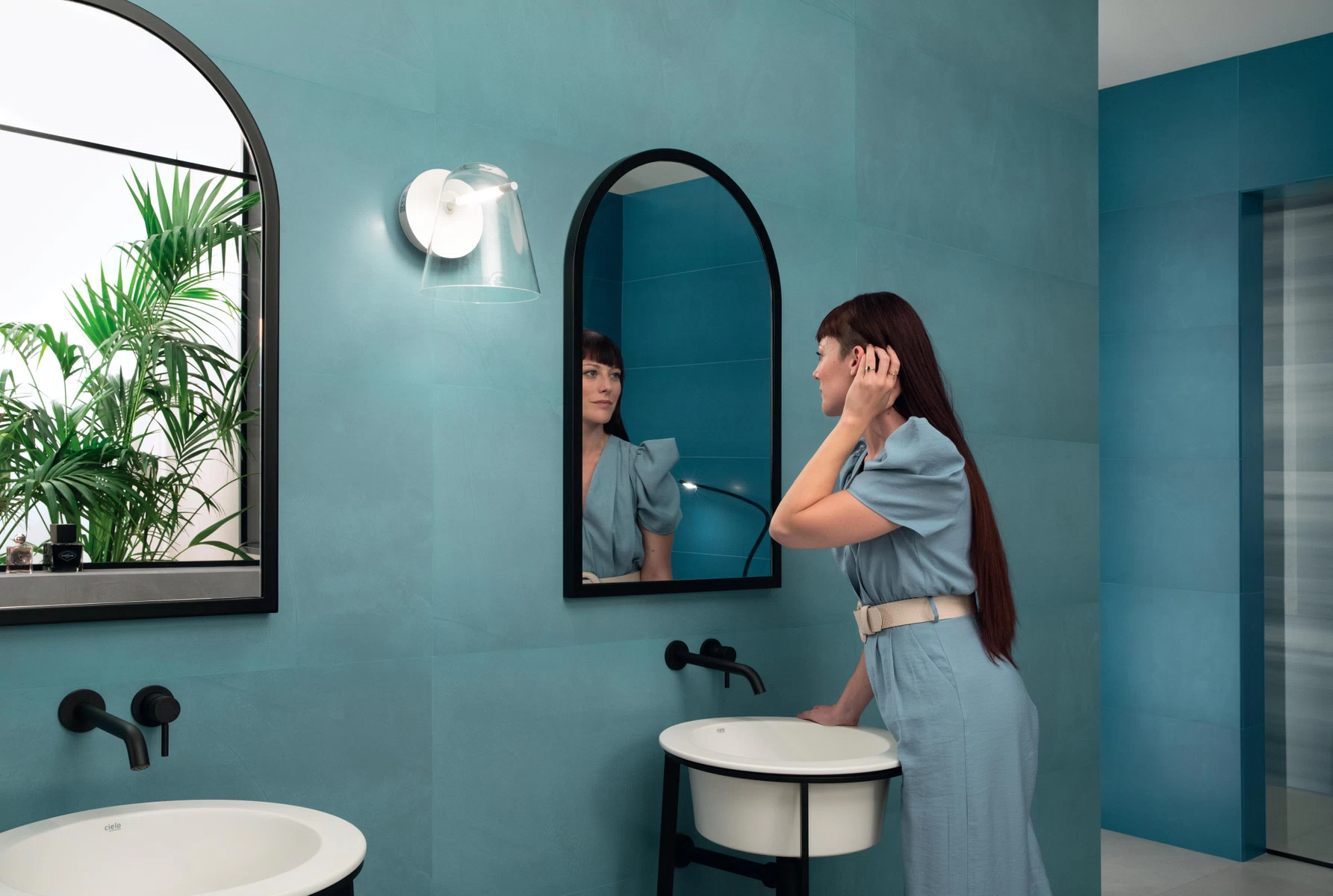
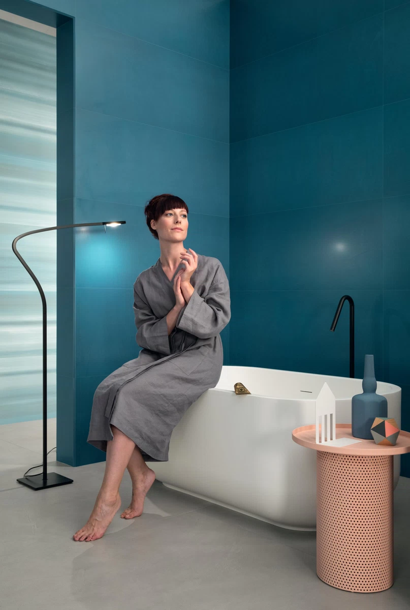
Prism Collection, Atlas Concorde
With the Prism collection, which recreates the three-dimensional effect of hand-troweled surfaces on porcelain floor and wall tiles, color is treated as an essential design element. Indeed, the genesis of the project was the observation of prismatic light and color as a "delicate vibration," as stated by Piero Lissoni, color consultant for the collection. The 13 original color palettes selected stem from the consideration of color as an energy that, along with shapes and volumes, helps define spaces: soft pastel colors that can evoke emotions and harmonize spaces.
A company or retailer considering the NestHouse trend should focus on:
- Soft Dreamscape: The possibility of escaping from the present to momentarily take refuge in a sensory sphere of well-being characterized by color.
- Color Power: The expressive power of color redefines the identity of spaces and people.
- Textured Colors: The original workmanship of the material and colors that create a vibrant atmosphere.


Be Inspired